Do you know cues? Those clickable colorless stacks of documents in NAV 2009, that turned into clickable blue stack tiles in NAV 2013 R2, and that worked on top of FlowFields of type Integer?
Well, in NAV 2015, this munch bunch has turned into clickable blue tiles with pictures and colorful indicators that are configurable per user, that work on top of any kind of numeric fields (normal or abnormal), or better yet, on top of any kind of numeric expression (you can bind them to RANDOM(1000) for all NAV cares).
Everyone is entitled to my opinion, so I’ll openly share it here. If you ask me, the idea of the cues was a cute one but not at all that useful, for a number of reasons. Foremost, in real life scenarios, those stacks grew and kept growing. And once you have any given number of stacks, each showing thousands of somethings inside, they suddenly lose both their appeal and their usefulness. And often you couldn’t really tell: what does a high stack mean? A good thing? A bad thing?
At some point in between versions 2013 and 2013 R2, somebody at Microsoft figured out that now that tiles became all so popular as user interface elements, maybe we could have some tiles in NAV too, and why not show cues as tiles. It was a nice touch that blended perfectly with the new look and feel of NAV 2013 R2.
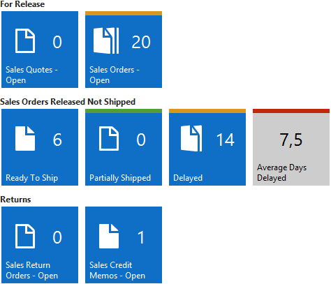
And finally in NAV 2015 we get real tiles, not only showing a single stack of document based on a FlowField of type Integer and the Count function of some record in some table, but showing any one of the available 21 pictures and any numeric information from any field, or any numeric expression for that matter. Depending on whether they are merely an indicator or a clickable element, they render in blue or gray, respectively, and depending on user configurable scales (per user, per cue object) they also show a colored indicator bar that can take green, orange, red, or gray color.
For example, this is how cues show in the Susan’s role center:
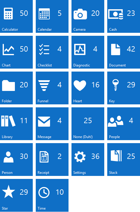
It’s interesting, there are twenty one images available, and Microsoft didn’t put a single one of them on the most prominent role center in the whole application. As I mentioned, in NAV 2015 you don’t have to show only stacks of documents, you can actually show an image, one of 21 available (it’s 22 actually, with the “None” image included) turning the cue into a real tile that carries a more direct meaning than a uniform stack of documents.
Here I’ve bound the RANDOM(50) source expression to 22 cues showing all 22 images, so that you can see what they look like:
There are a couple of things with these new cues that I don’t like, though:
- The image is hardcoded into the cue’s field control. That’s a pity. When color indicators are configurable, why couldn’t they just enabled us to configure which picture we want to see in the cue?
- No matter what you do, the cue always shows the number. No way you can only show the image.
In all other respects, I really love these new cues and how they work, and I’ll definitely blog more about them in the future.


They don’t necessarily grow 🙂
I’ve borrowed the cue idea and put it to NAV 5 @ one of our projects. The consultant was great, and put so much effort into getting the process streamlined, that @ end of the day all 7 cue numbers are (almost) 0 for all the inventory managers 🙂
Otherwise, can you freely code the click action as well?
Yes, absolutely. You can put whatever you want to the OnAction trigger and it nicely executes. Have no means to check it right now, but I have a feeling that there is no more that “no-code-on-rolecenters” restriction in place.
I wonder what happens with left hand pane – I’ve always found it unnecessarily complicated with some items coming from Actions, some from Cues, some from saved views.
Pingback: Any clue about cue? – 9/20, Navigate Into Success |
Pingback: NAV 2015 Blog Landing Page - Van Vugt's dynamiXs